
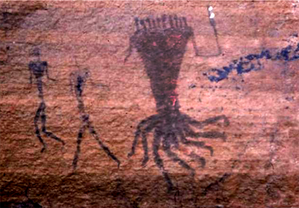
As you may be aware, South Africa is home to some of the greatest concentration of rock art in the world. Due to the layered nature of so many of them, the real number cannot be accurately pinned down – but their origin is not disputed. That they are the creation of the San people – South Africa’s First Nation – is known, and has been well documented since the 18th Century. As far as the origin of the specific image that came to inform the design of the Clan, that image is known to be located outside Tarkastad in the Eastern Cape Province – an area that is particularly rich in San rock art, found in the numerous sandstone caves and rock overhangs that are characteristic of the landscape of the area.
This is the image in question:
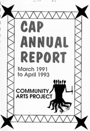
A rendered version of the same image was used as a section header in a paper titled ‘Rock Art and Sequence In The Eastern Cape’, by Simon Hall. This was the clue that led researcher Greg Dunn to tracking down the Tarkastad image. The same illustration was used by the Cape Town-based Community Arts Project in the early 1990’s as the organisation’s logo, with some modification:
In the initial phase of organising the very first AfrikaBurn during the period 2006 and 2007, the co-founders were looking for a symbol or icon that could represent the AfrikaBurn community and experience. The Tarkastad image, and the CAP version, were considered ideal, as the concept it represented (a community as one, united) was a perfect fit. In the words of co-founder and graphic designer Lil Black (aka Lil Visser):
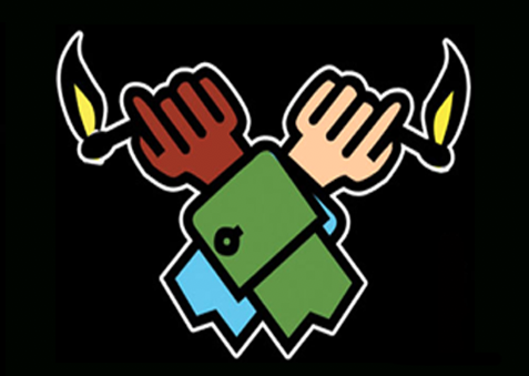
“We needed an emblem. Paul sent me a logo by a designer involved with Burning Man. It was a… image of a brown and a white fist holding aloft burning matches…”
“I didn’t think did justice to what we were komplotting here at the end of Africa. I remembered that in my vast collection of images there was a teeny black and white graphic representation of a San cave painting from Tarkastad depicting one body, several heads and many dancing feet. Apparently in rock art, a polymelia image narrates ‘the sensation of having one or more extra limbs as a result of hallucinatory sensations experienced by dancing shamans as they perform healing, rainmaking and other rituals during a trance dance ceremony’.”
“It didn’t depict any particular gender, and captured the collaboration and community we wanted to inspire. But most importantly, for me anyway, it was an image made by an artist of the First People. To my great joy it became the official Afrika Burns emblem and the inspiration for the main burn effigy, imaginatively reinterpreted by various artists over the years. In time of course I realised that it was also symbolic of how many heads will seldom all be in agreement, and that the multitude of dancing legs can dance to different drums.”
In making use of the image, even in its modified form as the icon now recognised as the AfrikaBurn Clan, the founders of AfrikaBurn sought to obtain permission from the San community. In doing so, members of AfrikaBurn’s team sought the Khomani San’s opinion on the use of a San image for the organisation. The indication from the San elders was that they were happy for the image to be used, as its use would serve as a graphic that would raise the profile of the San people wherever it was seen. This has been echoed by consultation with Khoi/San elders that have participated at AfrikaBurn from 2016 onwards, including members of Khoikhoi and San elders from Kalahari, Northern Cape, Beaufort West and George, Western Cape including David Rooi and Abraham Kruiper (brother of the late San leader David Kruiper) and Piet Berendse.
With input from the other co-founders of AfrikaBurn, Lil Visser began the process of designing the Clan as we now know it today, in 2006. In achieving the final design, she made use of the example of the CAP’s logo (for which permission was sought from the then-head of CAP Graham Falken and other members of the now-defunct CAP) as well as the originating rock art example, the same as that sought by Greg Dunn in his research.
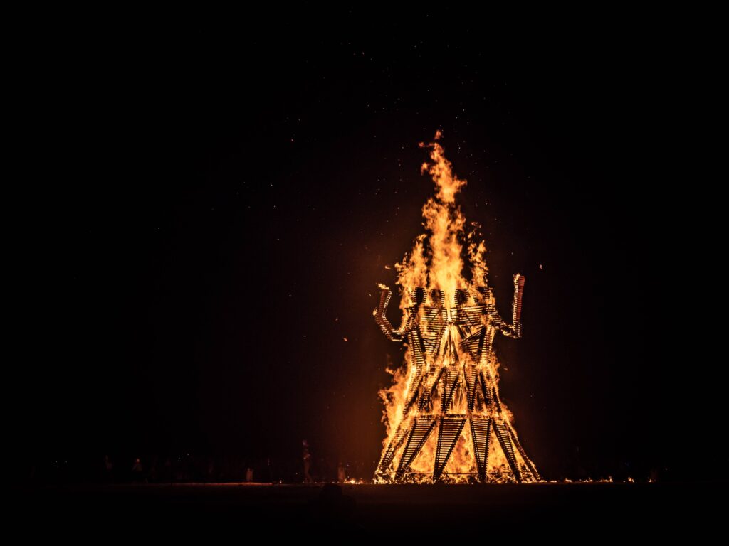
In designing the Clan as an identity, Visser cleaned up the image in Photoshop and added two arms (which were indistinct in the original rock art image) and placed it into an encircling device with added ‘spikes’ that represented the flames associated with a burn. The final design has since been used from the first AfrikaBurn in 2007 (when it was named ‘Afrika Burns’) to date, and has been the inspiration behind all Clan effigies held at the Tankwa events, though these are open to creative interpretation on the part of the artist, which explains why every year’s event effigy looks different.
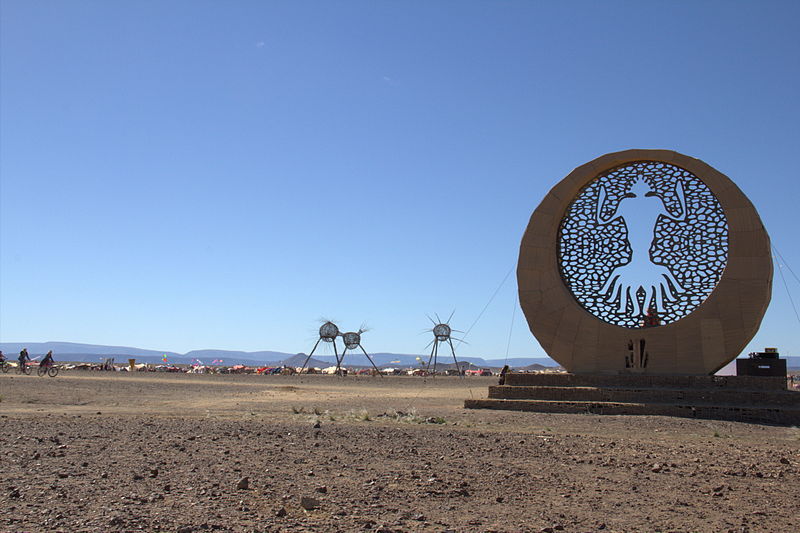
This is the final design now used as our emblem:
![]()
Important note: the Clan design is never used for any profit making (for example, on merchandising or other branded & sold items). However, if you have a plan to make and gift items at our event, you’re welcome to get a high-res version by emailing [email protected]
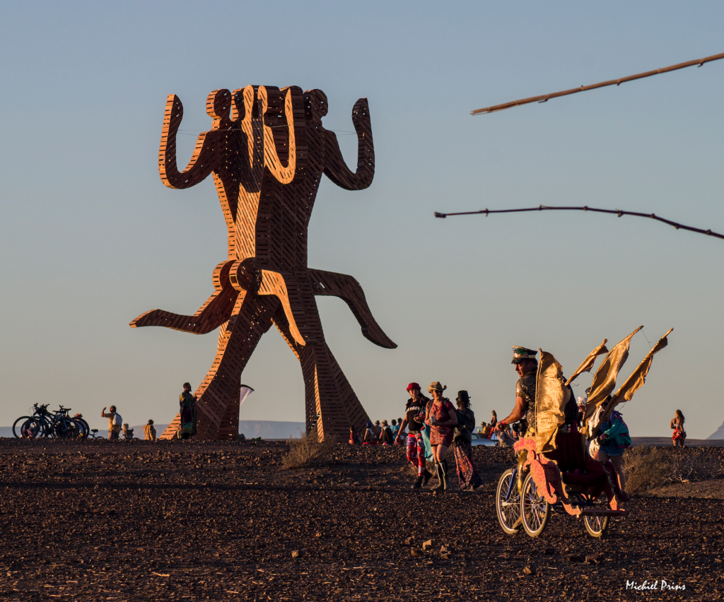
Design: Lindsay Cessford
Build: Mike Rule (lead) and Izak Martin, Alex Hart, Dewald Van Tonder, Giecar Jan Barroga, Malachy Lord-Rule, Dale Calder, Chris Denovan, Jule Beam Erasmus, Halen Ray Erasmus, Steve Martin, Yonga Mditshwa, Siyamthembu Mboxa, Andrew Hirson, Johann Schultz, Marco Bertoldi, Thomas Steiner, Mava Xhishe, Tommy Lee, Ricardo Moses, Mbulelo Simayile, Snethemba Mgeshulu, Valerie Johnson, Britt Stroebel, Monica Von Schnitzelstein
Lighting design & build: Thomas Steiner
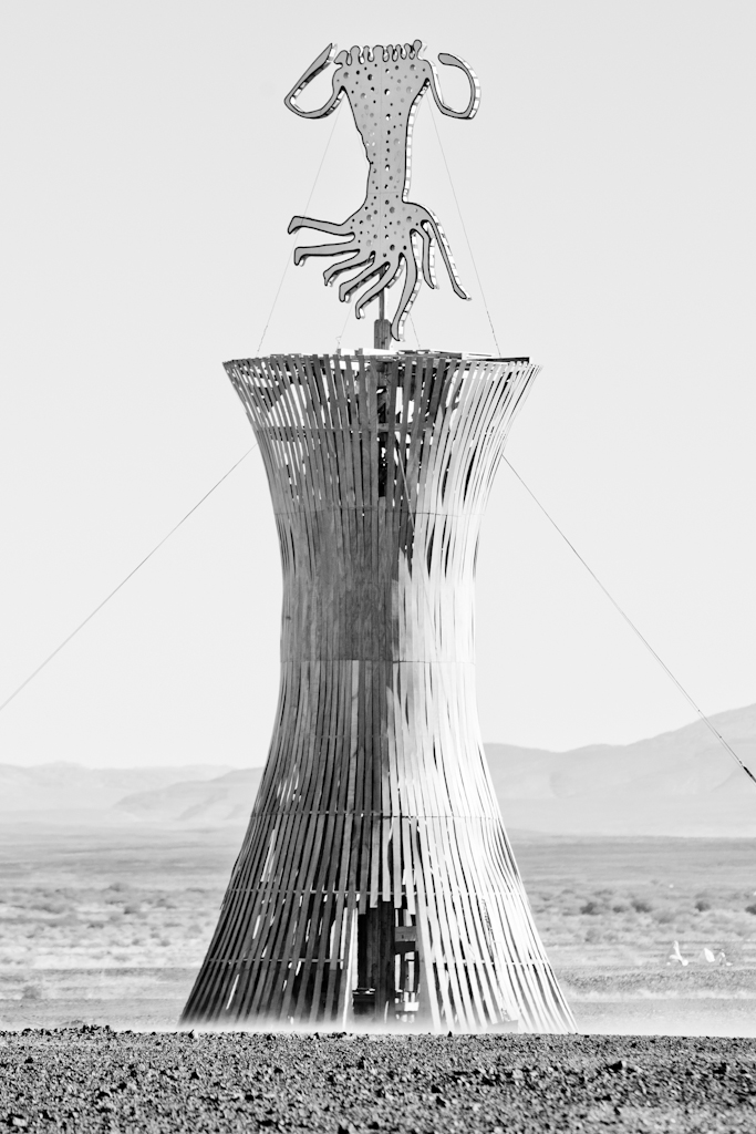
Photo: Jonx Pillemer
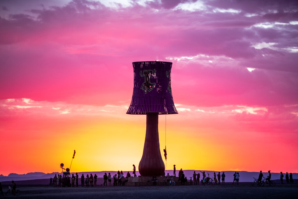
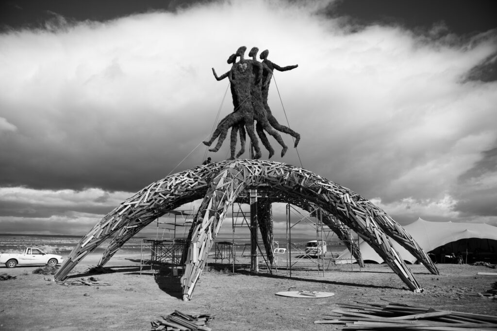
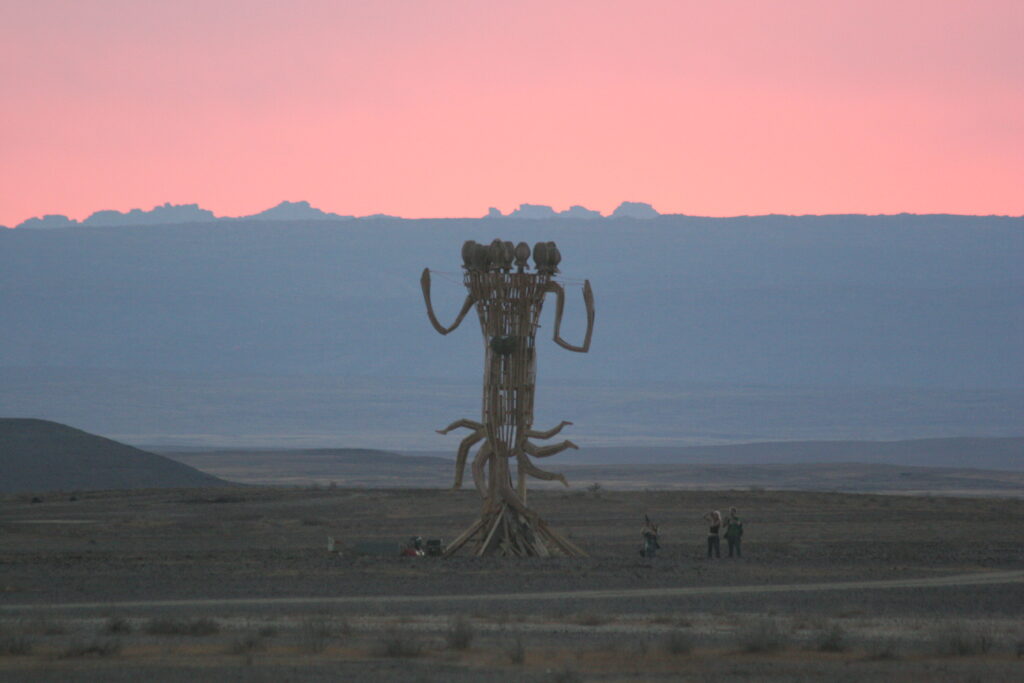
Design: Simon Dunckley
Build: Mike Rule & crew.
Photo: Michiel Prins
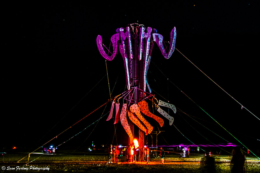
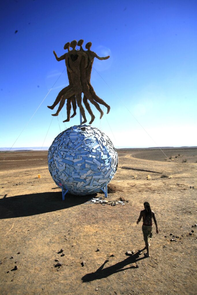
Design: Egon Tania & Peter Forbes
Build: Egon Tania and Peter Forbes. Crew consisted of a wide range of volunteers including but not limited to members of the Metalheads camp and Fata Morgana crew.
Photo: Sean Furlong
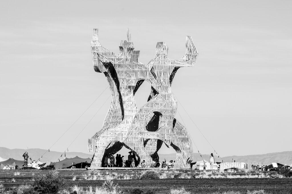
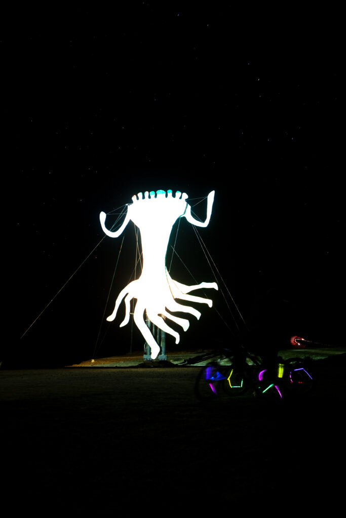
Design: Brendan Smithers & Simon Dunckley (with input from Daya Heller)
Build: Mike Rule & crew.
Photo: Jonx Pillemer
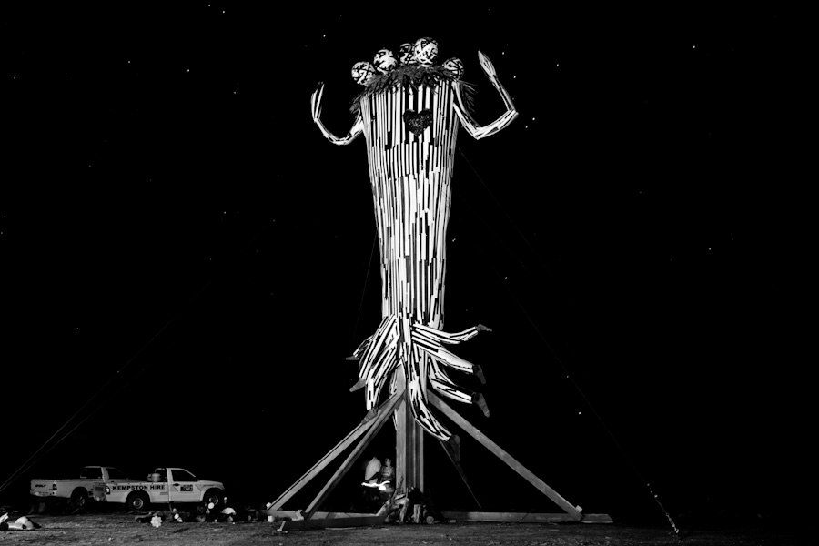
Design: Nathan Victor Honey
Build: Sutherland Kuns Opleidings Projek (SKOP).
Additional Info: This year’s effigy structure, as part of the SKOP skills transfer & arts initiative was built & prepped in the Sutherland town square, then disassembled and re-erected on site.
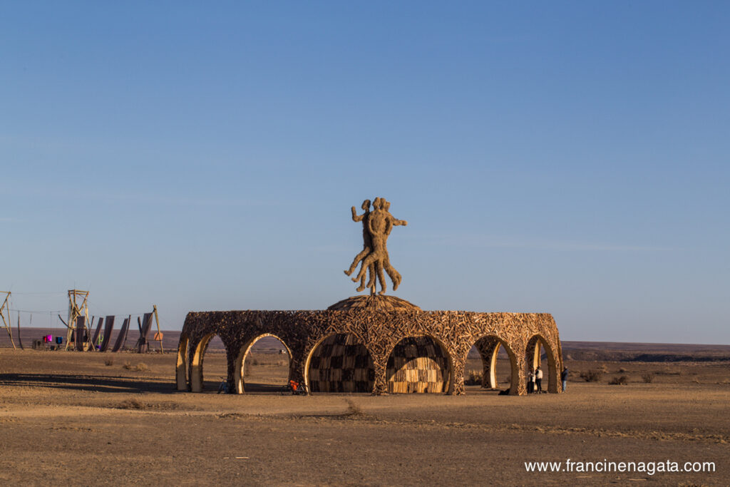
Photo: Francine Nagata
Design: Brendan Smithers
Build: Brendan Smithers & Technology.Tradition crew.
Photo: Michael Groenewald
Design: Brendan Smithers
Build: Technology.Nature.Tradition crew.
Photo: Axxter99!
Design: Mike Rule
Build: Mike Rule and crew.
Photo: Jonx Pillemer
Design: Nathan Victor Honey and Marisa Marques
Build: Nathan Victor Honey, Marisa Marques and crew.
Photo: Jonx Pillemer
Design: Nathan Victor Honey
Build: Nathan Victor Honey, Marco Guidetti and crew.
Photo of Clan & Buffy Braveart: Graham Abbott
Design: Egon Tania
Build: Egon Tania & his crew.
Photo: Jonx Pillemer
Design: Paul Jorgenson
Build: Brendan Smithers and the Technology.Nature.Tradition crew.
Photo: Jonx Pillemer
Design: Uys Van Der Merwe.
In our first year the whole community helped to finish the structure, including Up Rize, Patrick L’Amour, Brendan Smithers, Nathan Victor Honey and many more.
Photo: Monique Schiess